
Crafting compelling call-to-actions (CTAs) is crucial for converting website visitors into customers. A well-written CTA can significantly impact your website’s conversion rate, driving sales, sign-ups, and other desired actions. This guide provides actionable strategies and practical tips for writing effective CTAs that resonate with your target audience and encourage them to take the next step. Learn how to optimize your website copy and create high-converting CTAs that deliver measurable results.
From understanding the psychology behind effective CTAs to crafting clear and concise language, this guide covers everything you need to know to transform passive browsers into active participants. We’ll delve into the importance of using strong verbs, creating a sense of urgency, and aligning your CTAs with your overall marketing goals. Whether you’re aiming to increase conversions on your landing pages, boost email sign-ups, or drive product sales, mastering the art of the call-to-action is essential for achieving online success. Prepare to learn how to write CTAs that truly convert.
Understanding Your Target Audience
Before crafting a compelling call-to-action (CTA), you must thoroughly understand your target audience. A CTA that resonates with one group might fall flat with another. Knowing your audience is paramount to creating effective CTAs that drive conversions.
Consider these key factors when analyzing your target audience:
- Demographics: Factors like age, gender, location, education, and income level can influence how your audience perceives and responds to your CTA.
- Psychographics: Understanding your audience’s values, interests, lifestyle, and attitudes provides deeper insights into what motivates them.
- Online Behavior: How does your audience interact online? Where do they spend their time? What kind of content do they engage with? These are crucial questions to answer.
- Pain Points and Needs: What problems are they trying to solve? How can your product or service help them? Addressing these directly in your CTA will increase its effectiveness.
By thoroughly researching and understanding these aspects of your target audience, you can craft CTAs that speak directly to their needs and motivations, resulting in higher click-through rates and ultimately, more conversions.
Crafting Clear and Concise Call-to-Action Copy
A compelling call-to-action (CTA) needs to be easily understood. Clarity is paramount. Users should immediately grasp the intended action upon reading your CTA. Avoid jargon, technical terms, or overly complex language. Conciseness is equally crucial. Keep your CTA short and to the point. Every word should contribute to the overall message and encourage conversion.
Think of your CTA as a mini instruction manual. It should tell the user precisely what to do and what to expect. For example, instead of a vague “Learn More,” try something more specific like “Download Our Free Guide” or “Get a Personalized Quote.” This provides clarity and sets clear expectations.
Brevity is key. Aim for a CTA that is easily scannable and digestible within a few seconds. Eliminate unnecessary words and focus on conveying the core message efficiently. Short, punchy CTAs often outperform lengthy, convoluted ones.
Creating a Sense of Urgency with Your Call to Action
Instilling a sense of urgency encourages immediate action, boosting conversion rates. This involves subtly communicating that the offer is time-sensitive or limited in availability. Urgency, however, should be used responsibly and ethically.
One effective tactic is incorporating time-limited offers. Phrases like “limited-time offer,” “ends tonight,” or “sale ends [date]” create a fear of missing out (FOMO). Highlighting limited quantities, using phrases such as “only a few left” or “while supplies last,” also drives immediate action.
Using time-sensitive language within the call-to-action itself can also be impactful. For instance, “Shop Now Before It’s Gone” or “Get Your Discount Today” encourages immediate clicks.
Remember, authenticity is key. False or manufactured urgency can damage credibility. Ensure any limitations you present are genuine.
Using Strong Verbs and Action-Oriented Language
The foundation of a compelling call-to-action lies in the verbs you choose. Strong verbs inject energy and direction, prompting users to take immediate action. Avoid weak verbs like “submit,” “click here,” or “learn more.” Instead, opt for verbs that create a sense of action and benefit.
Think about the specific action you want users to perform. If you’re offering a free trial, use “Start Your Free Trial” rather than “Click Here for a Free Trial.” For an e-commerce site, “Shop Now” or “Add to Cart” are more compelling than “See More.” The language surrounding your verb should also be action-oriented, focusing on the benefit users receive. Instead of “Download our brochure,” try “Download Your Free Guide to [Topic]”.
Here’s a quick comparison:
| Weak Verb/Phrase | Strong Verb/Phrase |
|---|---|
| Submit | Get Started |
| Learn More | Discover More |
| Click Here | Download Now |
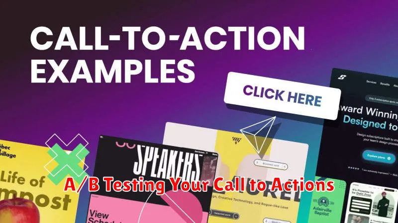
A/B Testing Your Call to Actions
Even with careful planning, the most effective call to action often reveals itself through testing. A/B testing provides a structured approach to optimizing your CTAs for conversions.
The process involves creating two versions of your call to action (A and B) with a single differing element, such as the wording, button color, or placement. These versions are then presented randomly to equal segments of your audience.
Monitor key metrics such as click-through rate (CTR) and conversion rate for each version. The version that performs better statistically becomes your new control, against which further variations can be tested.
Consistent A/B testing allows you to continually refine your CTAs, ensuring they remain effective and aligned with your audience’s evolving preferences.
Highlighting the Benefits of Taking Action
A compelling call-to-action (CTA) doesn’t just tell users what to do; it tells them why they should do it. Clearly highlighting the benefits of clicking that button or filling out that form is crucial for driving conversions. Users need to understand the value proposition—what’s in it for them?
Focus on the positive outcomes users will experience. Instead of simply saying “Download Now,” try “Download Now and Get Instant Access to Our Exclusive Guide.” This emphasizes the immediate benefit of receiving the guide. Instead of “Sign Up,” consider “Sign Up and Receive a 10% Discount on Your First Order.” This clarifies the incentive for signing up.
Clearly articulate the value your offer provides. Will it save them time? Will it help them solve a problem? Will it provide them with valuable information? Make sure your CTA copy directly addresses these benefits. Concisely communicating the advantages encourages users to take the desired action.
Making Your Call-to-Action Visually Appealing
A visually appealing call-to-action (CTA) significantly impacts its effectiveness. Design plays a crucial role in grabbing attention and encouraging clicks.
Color contrast is paramount. Your CTA button should stand out from the surrounding background. Use colors that complement your website’s overall design while ensuring the button remains prominent. Consider A/B testing different color combinations to determine what resonates best with your audience.
Size and shape also contribute to visual appeal. Make your CTA button large enough to be easily seen but not so large that it disrupts the page’s flow. Experiment with different shapes, such as rounded corners or rectangular buttons, to find what best suits your design.
Whitespace around your CTA gives it room to breathe and further enhances visibility. Avoid cluttering the area around the button, allowing it to stand out as a clear focal point on the page.
Ensuring Your Call-to-Action is Mobile-Friendly
In today’s mobile-first world, ensuring your call-to-action (CTA) is optimized for mobile devices is crucial. A mobile-friendly CTA significantly impacts conversion rates. Users should be able to easily tap and interact with the CTA on any screen size.
Button Size and Placement are key considerations. Buttons should be large enough to comfortably tap with a finger, avoiding accidental clicks on other elements. Place the CTA in a prominent, easily accessible location on the screen, ideally within the user’s thumb-reach zone.
Font Size and Readability also contribute to a positive mobile experience. Use a legible font size and ensure sufficient contrast between the button text and background color. This makes the CTA clear and inviting for users on smaller screens.
Minimize Form Fields on mobile. Long, complicated forms can deter users on mobile devices. Keep forms short and concise, requesting only essential information. Consider using features like autocomplete to streamline the process.
Tracking and Measuring Your Call-to-Action Performance
Tracking your call-to-action (CTA) performance is crucial for understanding what works and what doesn’t. Analyzing data allows you to optimize your CTAs for better conversion rates. Without tracking, you’re essentially guessing at what resonates with your audience.
Key metrics to monitor include click-through rate (CTR), which measures how often your CTA is clicked compared to how often it’s seen. A low CTR might indicate a weak CTA message or poor placement.
Another important metric is conversion rate. This measures how many clicks on your CTA result in the desired action, whether it’s a purchase, a sign-up, or a download. A low conversion rate might suggest a disconnect between the CTA and the landing page experience.
Tools like website analytics platforms can provide valuable insights into these metrics. Use this data to refine your CTAs, experiment with different wording, placement, and design, and ultimately improve your overall website effectiveness.